Whether you’re cruising down the aisles of the grocery store, or speeding down the freeway, you’re guaranteed to come across a few famous logos. Take one glance at any one of these logos and you instantly recognize the brand, but did you know there’s sometimes a hidden message buried in them? It’s surprising, but true.
Here are 17 famous logos that have a hidden message. Take a look:
1. VAIO

At first you just see the word VAIO, but look a little closer and you’ll see the first two letters represent an analog symbol and the last two letters are binary.
2. Baskin Robbins

Take a look at what’s highlighted in pink. Look familiar? It’s a 31, which is the number of flavors they offer.
3. Formula 1

Between the letter F and the speed marks is the number one.
4. Northwest Airlines

This logo actually has two hidden messages. First, it features an N and a W in negative spaces. Second, the triangle in the circle points northwest as if it’s a compass.
5. Tostitos

The two middle T’s in Tostitos shows two friends sharing some tortilla chips and salsa.
6. Elefont

Look at the negative space in the lowercase E – it’s an elephant’s trunk!
7. Hope for African Children Initiative

When you first look at it, it looks like only a map of Africa. But take a closer look and you’ll see an adult and child facing each other.
8. Toblerone

Notice anything?

9. Hartford Whalers

This simple-looking logo is actually quite clever. First, you have the whale’s tail, the letter W in green, and an H in the white space.
10. Goodwill

Take a look at the G in Goodwill. It’s actually a smiling face!
11. Spartan Golf Club

This logo is pure genius. Look at it one way and you see a Spartan helmet. Look at it another way and there’s a golfer taking a swing.
12. Unilever

Unilever produces so many different products that sometimes it’s hard to keep track of everything they do. Lucky for us, there’s symbols for literally everything they make right in their logo.
13. Amazon

See where that arrow points? It suggests that you can buy everything from A to Z on Amazon.
14. Sun Micro Systems

Usually boring tech companies stick with boring, meaningless logos, but not Sun Microsystems. Take a closer look at that diamond and you’ll see it actually says Sun in every direction.
15. Wendy’s

If you look at Wendy’s collar you’ll actually see the word “MOM.” Their thinking is that the next time you think of mom’s cooking, you’ll think Wendy’s.
16. The Bronx Zoo

Look closely at the giraffes’ legs. You’ll see the animals are within a big city!
17. Coca Cola

Look closely at the “o.” Do you notice anything? No? Don’t worry because most people wouldn’t notice it. It’s actually the Denmark flag. This wasn’t always the original intention. Coca Cola discovered that part of its logo looks like the Danish flag, which has been named the happiest country on earth. Once they discovered that, they set up a media stunt in Denmark’s biggest airport, where they welcome people with flags. Still can’t see the flag? Here you go:

Related posts:
 What We Have Achieved in Year 2015 (Best of Pakistan) – Part 4
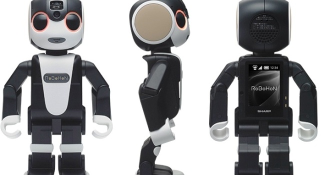 This Mobile Can Dance, Sing, and Walk. Meet “RoBoHoN”, A Revolutionary Phone in Industry
 What We Have Achieved in Year 2015 (Best of Pakistan) – Part 3 (Photos)
 Back to Stone Age (Awesome Video)
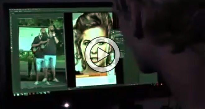 Photoshop Live – AWWESSSSSOOOMMEE (Video)
 What We Have Achieved in Year 2015 (Best of Pakistan) – Part 1 (Photos)
 What We Have Achieved in Year 2015 (Best of Pakistan) – Part 2 (Photos)
 Pehla Nasha (Cover by Alaa Wardi) – Video
 Man Aamadeh Am (Coke Studio – Gul Panrra & Atif Aslam) Video
 National Anthem of Pakistan on Guitar and Rubab (Video)
 SUGRU – Fix That Thing (Amazing Invention) – Video
 Top 10 Biggest Cities Of Pakistan.
